In a world where we are constantly flooded with information, it’s interesting how we made to ignore so much going around us. In Pallasmaa’s essay “The eyes of the skin” I can sense that same idea, complemented by an idea of frustration.
The essay is divided into two parts – the first one expires the issues of designing for architecture, but at the same time focusing only the visual and thus missing opportunities to impress other senses and creating a more Holistic and engaging experience. Pallasmaa explains that phenomenon as part of our evolution as people and the discovery of various technological advances. The idea is that that focuses on the visual, just one of our five senses, is rooted not only in architecture but in other design disciplines as well – advertising, television, print… (fig.1)

fig. 1: “Just Form, No Function” – an art piece displaying a form and shape without any actual function, presented as an example of ocularcentrism with a hint of sarcasm. Link: deco1_64735.jpg
The second part of the essay explores how to tackle the issues presented earlier.
Most importantly, the thing that should be taken out as an idea is how in our modern culture, the eyes take a leading point as the most important sense, and they shouldn’t.
“As the ocularcentric paradigm of our relation to the world and of our concept of knowledge – the epistemological privileging of vision – has been revealed by philosophers, it is also important to survey critically the role of vision in relation to the other senses in our understanding and practice of the art of architecture.” (Pallasmaa)
If we design for the full range and spectrum of our senses we would get a more interesting and captivating location that would quench our thirsty for excitement. I will contradict myself from earlier, but here the bottom that we have five senses is not enough. According to some studies, we experience the world around us, depending on how we count, with up to 21 different senses. This is an interesting motion because we experience the world around us not just by setting or smelling it, but with seemingly shocks feelings. Like the sense that helps us to feel how our muscles and joints are moving and in essence help us to determine where our body parts are even if our eyes are closed. (GROUPIE)
I gave that example because when you start thinking in that direction we realise how we experience the world in interesting ways that we don’t really realise. It’s not just what we see our touch, is the idea of where we are placed, how the walls interact with the light and make us feel in the space, are we existing in just the physical plane or on a higher mental level as well.
But possibly the most interesting idea here stems from a concept found in a discussion on the topic of experiencing art, music, and architecture.
“Scruton’s fascination with ‘seeing as’ is at the heart of the matter, for with that one is led to have a visual image which is easily confused with what is actually seen. By contrast, what does one ‘hear’ when one ‘hears the sadness in the music’ ? What one hears is the music, but one’s image of sadness cannot be auditory: it is a non-auditory, and non-visual, kinaesthetic image of postures, gestures, and other bodily movements characteristic of feeling sad, so in no way could this be confused with anything heard. Scruton’s ‘aesthetic experiences’ are not experiences any more than Taylor’s ‘as-if experiences’ are.” (Slater, B. H.)
The idea here is that when we experience a piece of art, be it a painting, a song, or a building, we might be looking at it with just our eyes but the feelings that come with it might run deeper than just the eyes, creating emotional bonds that elevate the experience to new levels. Seeing something with your eyes might just be the start.
Taking all of this into an account designing for the turns out to be a lot more complicated than just incorporating a few touch surfaces and music as we discover that people experience the world in unknown, weird, interesting and emotional ways. We have senses that we never though we have, some people experience the world differently than others and what happens in our head is not always something we perceive concisely on the surface. A deeper and more sophisticated thought is always needed to create a clearer picture of what’s going on in a person’s head.
References:
Pallasmaa, J. “THE EYES OF THE SKIN” Architecture and the Senses.
GROUPIE, architecture. “How Do We EXPERIENCE ARCHITECTURE”. Architecturegroupie.wordpress.com. N.p., 2017. Web. 20 Mar. 2017.
Slater, B. H. “‘Experiencing’ Architecture”. Philosophy 59.228 (1984): 253-258. Web.


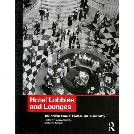
 Fig.2
Fig.2 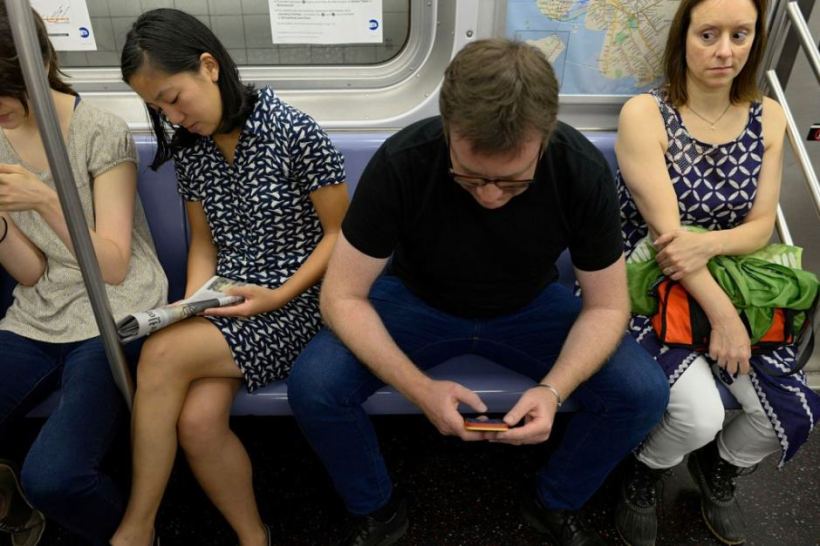 Fig.3
Fig.3 


/c(562-1.33333333333333-85.625-11.25-9.375)/f16_avermaetetom2.jpg)